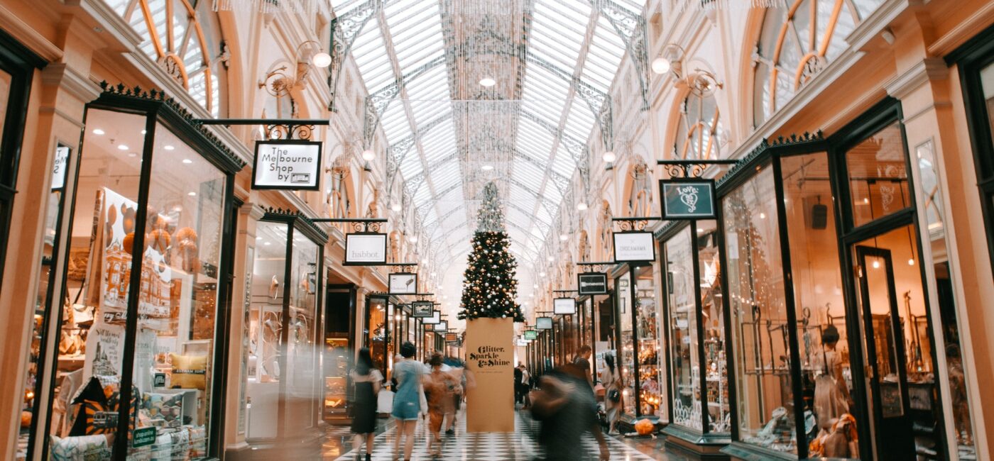
If you’re planning on starting a new travel blog, then you have to make sure that that the design blows away your readers. It should inspire their wanderlust and get them itching to pack their bags. A big part of making your travel photos, guides and stories stand out is giving them the perfect frame through the design you use. Here is a list of eight simple designs that you can use.
1. Map Based Design
One of the coolest ways to set up your travel blog is through a map based browsing design. The top of the fold is a map with marks of the places you’ve visited. Users can hover over each mark and a preview linking to your blog post for that location will pop up. While it looks technical, it’s an easy WordPress theme to install. You don’t have to mess around with your web hosting. You can install it in one click and activate it in your WordPress settings. Just make sure your web hosting provider is compatible with the latest version of WordPress.
Source: http://purethe.me/demo/?theme=wpv
2. Card Based Design
The card based design was popularized by Pinterest. It remains one of the more popular designs today because it does a great job in featuring images. The layout is fun to use and it allows you to get more of your content seen compared to a regular blog format. While you may think that the headline text for each blog post preview may get in the way, you can use a transparent font that only lights up when the user mouse over the post. If you want something simple but unique, you can’t go wrong with this layout.
Source: https://themeforest.net/item/the-traveler-responsive-wordpress-blog-theme/16459646?ref=dbcom

3. Carousel Style Design
The carousel is still one of the most popular design formats to bloggers. It allows you to showcase a large number of your images or content so that your favorite posts that may have been buried by newer posts can still be found by the user. Hither and Thither is a perfect example of a blog that uses this design. The blog customizes the carousel and showcases the top posts for the week. If you like this format, carousel plugins and scripts can easily be found online for free.
Source: http://hitherandthither.net/
4. Magazine Format
If you want to give your blog a professional look, then the magazine format is a good option. You can compile your photos into a magazine format and use an editorial approach to your content. Tiny Atlas Quarterly does this with their beautiful blog. They tell a story with their photography and base it around one location. Small doses of content are dispersed with the photography to provide the right context when it’s needed.
Source: http://tinyatlasquarterly.com/
5. Moving Hero Image
Looking to really wow your readers? You can use a moving hero image to display what seems like a video but is actually a compiled image. Stuck In Customs does this beautifully with what seems like stills taken through the use of drones. What’s really grabbing to visitors is that the images change from time to time, making you want to visit to see what new presentations are available. While this format is impressive, it’s not ideal for many people that want to make sure their site loads quickly for mobile devices.
Source: http://www.stuckincustoms.com/
6. Flat Design
If you’re looking for more of a minimalist design, then you can go with a flat design format. It can really add a classic or retro feel to your blog. It’s also great if you want to put the emphasis on your content and less on the stylistic elements of your website. The Volks blog does a great job with flat design. The grid layout is very clean and there is a minimal use of widget navigation. What’s really impressive about their blog is the font they use. It has high readability and is completely unique to other blogs.
Source: https://www.volkshotel.nl/en/blog?_ga=1.234064862.1167084389.1491315149
7. Parallax Design
Using parallax design is one of the best ways to wow your visitors. This design can be set up with your featured post set on a hero image. If the user wants to scroll down to see your other content, the hero image fades out with each scroll. This has been a popular design format for quite some time. If you want to start your travel blog out with a bang, you can’t go wrong with this approach. Just make sure you use the right images rather than using the effect for its own sake.
8. Grid Based Design
Looking for a unique way to present your photography? You can lay out the photos from you travels in a grid based design. This presents a unique way for the user to browse your content and photography. A WordPress theme called YourJourney also lets you set it up where the photos in the layout are interchanged with another after a brief period of time. So if the user isn’t impressed with one particular photo of Italy, he might come back when he sees another one being presented a few seconds later.
Source: https://yourjourney.wiloke.com/
There is an endless number of design approaches you can take with your travel blog. Hopefully, these designs have sparked the creativity inside you. But don’t think that you have to go overboard with your web design to make a great travel blog. There are plenty of travel blogs that use the standard format and do well. It’s really more about shining through with great content and photography than anything else.
Derek
No Description or Default Description Here